
CodeForce Tech Notes
Your Website Contact Path Should Not Make Customers Work
A practical checkup for small-business websites: make the next step clear, visible, trustworthy, and easy to use on mobile.
A good small-business website does not just explain what the business does. It helps the right visitor take the next step without hunting for it. That sounds simple, but it is one of the most common website problems: the homepage looks fine, the service descriptions are accurate, and the photos are current, but the path from interest to action is fuzzy.
That is where good leads quietly disappear. A customer may be ready to ask a question, book a call, request a quote, or check availability, but the website makes them work too hard. Most people will not announce that they got stuck. They will leave, compare another option, or decide to come back later and forget.
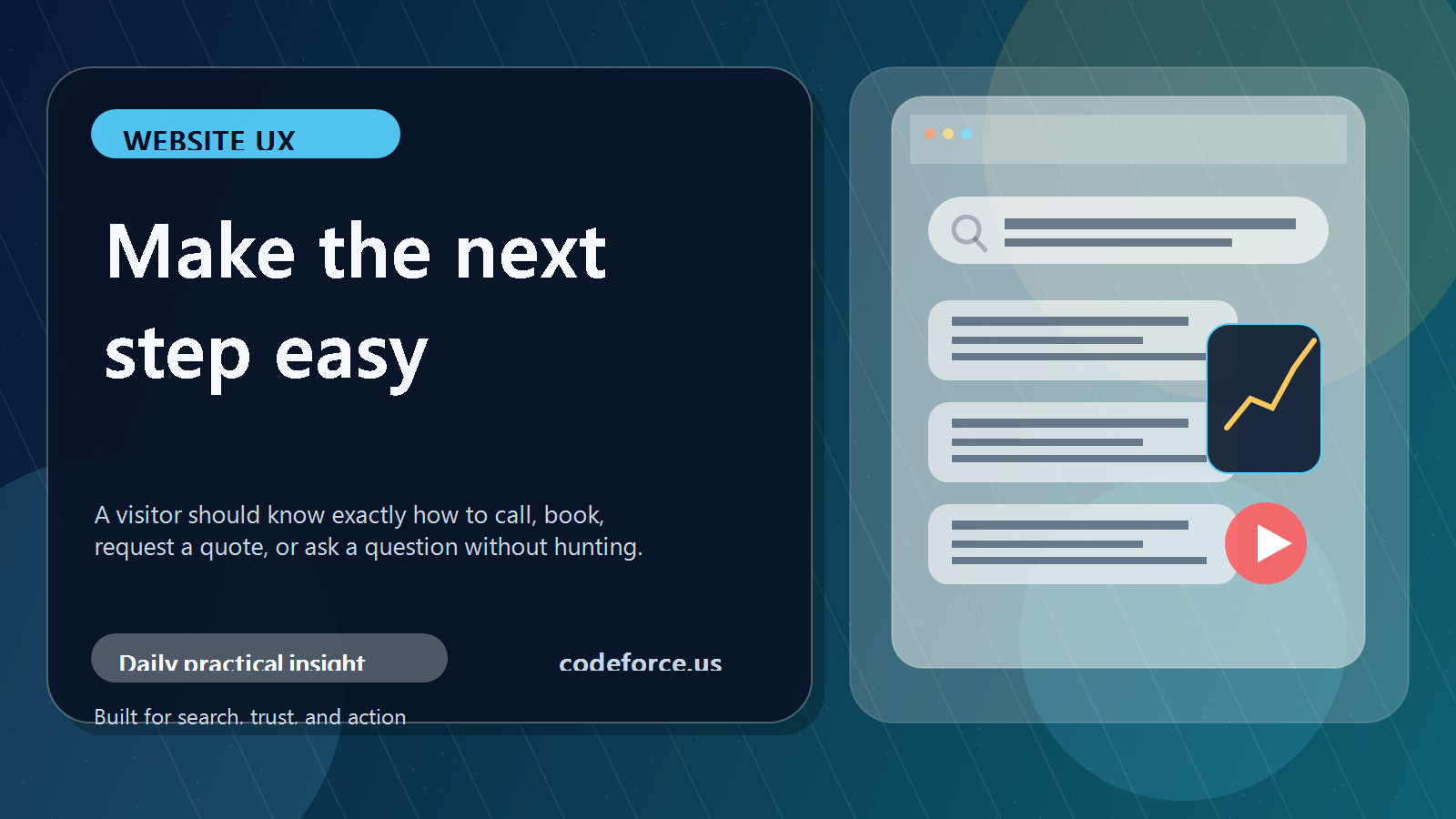
What a website contact path means
Your website contact path is the route a visitor follows from interest to action. It includes buttons, links, forms, phone numbers, booking tools, confirmation messages, and the words around those items. A strong path moves someone from “I might need this” to “I know exactly what to do next.”
For a small business, the contact path does not need to be fancy. It needs to be clear, visible, trustworthy, and easy to use on a phone.
Why visitors should not have to guess
If someone lands on a website and has to stop and think, several things may happen. They may not know which service fits their situation. They may not find the contact button after scrolling. They may run into a form that asks for too much information too soon. They may open a booking link without understanding what the call is for. On mobile, the most important next step may be buried below too many sections.
None of those issues mean the business is bad. They usually mean the website was built around information instead of the customer’s decision process.
A simple contact path check
- Is the main next step visible without searching?
- Does the button wording say what happens next?
- Is the contact option repeated after the visitor has enough context?
- Does the form ask only what is needed to start the conversation?
- Does the confirmation message explain when and how the business will respond?
The wording matters. “Book a Free Intro Call,” “Request a Quote,” “Schedule Service,” and “Send a Message” are usually stronger than vague labels like “Submit” or “Learn More” when the visitor is already ready to act.
Trust signals make the next step easier
A clear button is only part of the job. Visitors also need enough confidence to use it. Helpful trust signals include plain-language service descriptions, real business contact information, testimonials or examples, clear service-area details, HTTPS, updated forms, and a short explanation of what happens after someone reaches out.
One practical improvement to make this week
Choose one important page and improve the contact path there first. Start with the homepage, main service page, pricing page, or the page people visit before they call. Rewrite one button so it says exactly what happens next. Add a short sentence above the booking link. Move the contact option higher on mobile. Shorten the first-contact form. Add a simple “what happens next” note after the form.
FAQ about website contact paths
What is the best contact button wording?
The best wording names the action the customer actually wants to take, such as “Request a Quote,” “Book a Call,” or “Schedule Service.”
How many contact buttons should a page have?
Longer pages usually need more than one. Place the next step near the top, after the main explanation, and near the end.
Should a small business use a form or a phone number?
Use the option customers are most likely to trust and complete. Many businesses need both, especially on mobile.
What is the easiest first fix?
Test the site from a phone and make the main next step clear without scrolling or guessing.
Bottom line
A website contact path is not a decoration. It is part of the sales and service system. If the path is clear, visitors know what to do. If the path is confusing, even interested customers can disappear.

